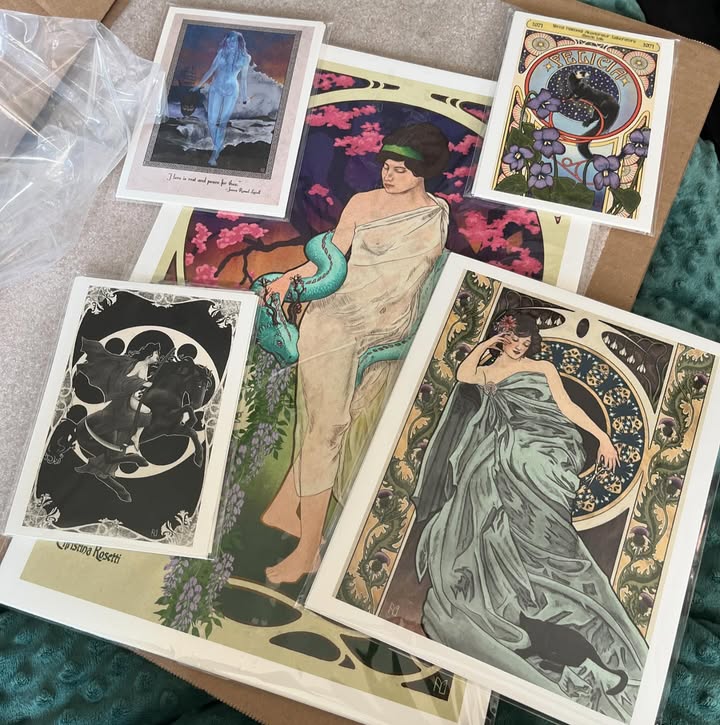
I’ve been implementing Art Nouveau styles into my art for a few years now. I always struggled defining my style, but back in 2023 I did an Alphonse Mucha study and it opened my eyes to all the possibilities. The general concepts of what I recognized as Art Nouveau, like the flowing lines, strong outlines, florals, and the the circle behind the figure, were all present and I wanted to do more. These are the ways I’ve taken those ideas and use them in my art.
Poster Style
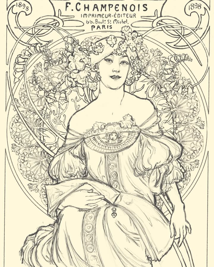
Some of the most well known instances of Art Nouveau were ads and posters. Alphonse Mucha, perhaps the most famous artist of the style, got his start making a poster for Sarah Bernhardt, a French theater celebrity of the time.
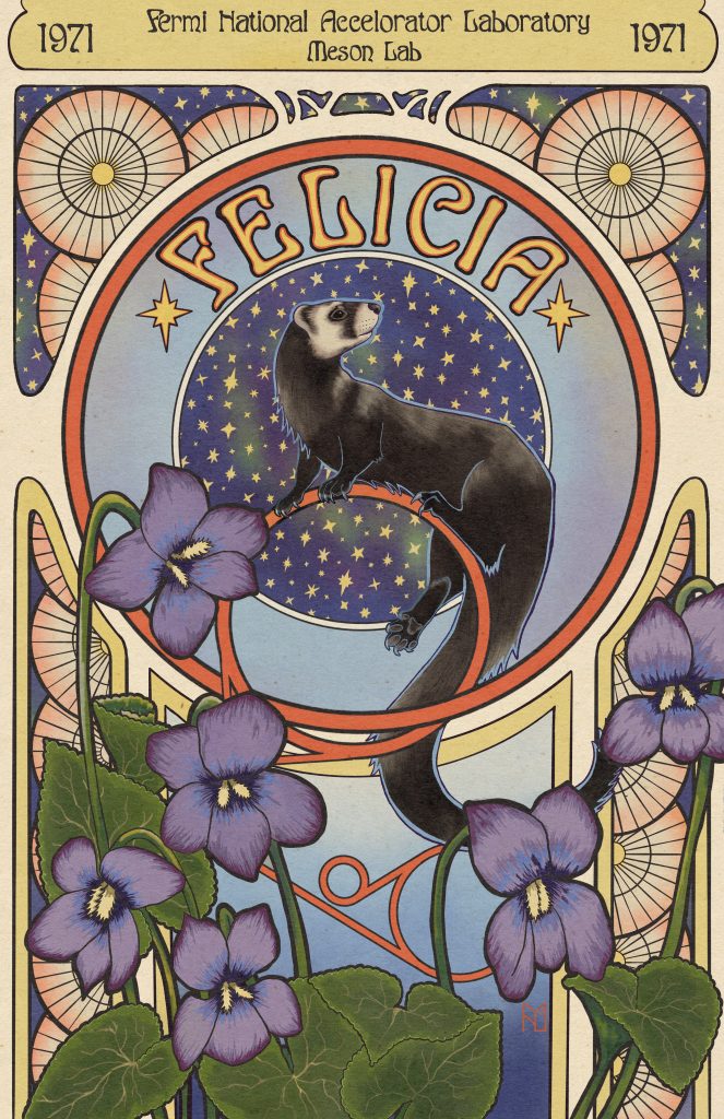
My intent for Felicia was to give her the celebrity status she deserves, so I leaned heavily into the poster aspect. She’s prominently featured in the center with her name emblazoned above her in large text. The year and location of the lab are at the top in a curvy abstract font, similar to how the theater and date of the show were displayed in posters.
Color Palette
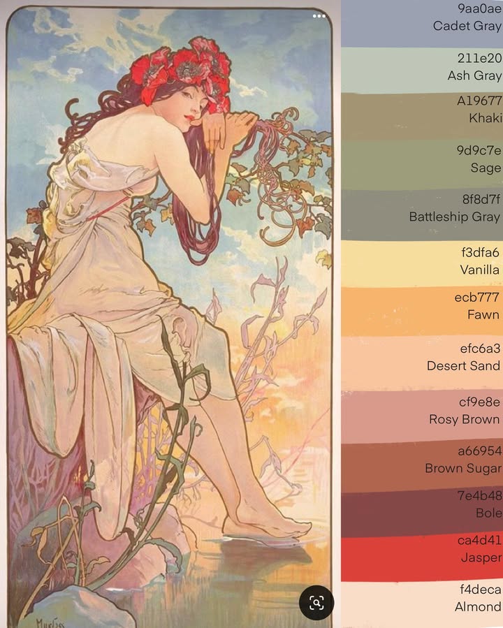
While this is definitely not a rule, some of the most recognized pieces from the time had relatively pastel and dilute color palettes. I broke down this piece by Mucha to show how light and airy the color scheme is, with the brightest color bringing attention to her face.
I tend to use darker and bolder colors than this piece specifically, but I keep this idea in mind when building a palette. For some pieces that are inspired by a particular kind of poster or media, I’ll import an example into Procreate and create a color palette from it, then use that is a launching point when it’s time to color.
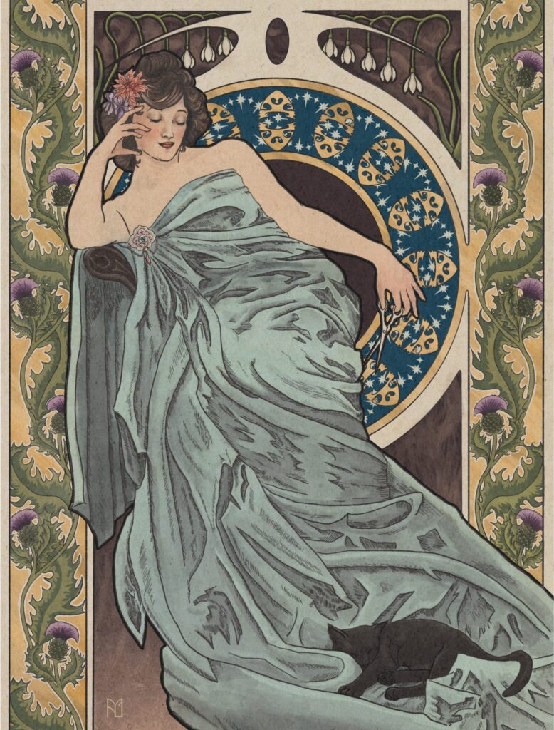
Female Figure
The female figure was a favorite subject during this time, which coincides with it also being one of my favorite subjects. The Art Nouveau movement took great inspiration from the Pre-Raphaelites which focused on the romantic fantasy side of the Middle Ages, often princesses and nymphs.
The subject is usually in a dynamic pose, sometimes partially nude and draped in heavily rendered fabric. Her shading is flat with lines being the primary demarcation for shading, with more detailed color and shading at focal points like the face, with a subtle color shift on the hands.
Borders and Moon Motif
The circle behind the subject is one of the most iconic features of Art Nouveau and is one of the easiest and fun things to incorporate. Sometimes it’s very literal, such as a halo behind the subject like in Do Not Disturb here, but other times its more subtle or part of the border.
The borders help give the illustrative and decorative feel that I really appreciate from the movement. As with the moon motif in this piece, the border is bold and takes up nearly half of the composition, but at other times it can be much more understated if present at all.
Strong Outline
Since the general style is illustrative, lines and outlines play an important role for me. The features of nearly everything have an outline and don’t rely on shading for separation. What shading I do include is a combination of hatching and color, depending on how much detail I want in that area.
The primary subject, for instance the cat in Élégante, I nearly always emphasize, making the outline significantly more bold. This draws attention to her and creates a clear separation between her and the background, which is especially useful with a more subdued color palette.
Organic Shapes and Perspective
Flowers and organic shapes are integral to the Art Nouveau style as the mentality was to battle the Industrial Revolution by bringing nature indoors. I use them anywhere I can put them, but especially in the foreground.
Perspective in these posters is a combination of flat layers and subtle shading. I add much more shading to my subjects, but how they interact with the more flat elements in the background is a fun exercise of breaking expectations. I’ll alternate what is in front of and behind things, sometimes breaking the rules by having things overlap and interlock in ways that wouldn’t normally make sense. But in the end I nearly always have flowers or leaves in the very front coming up from the bottom, almost as if the poster is being overtaken by them.
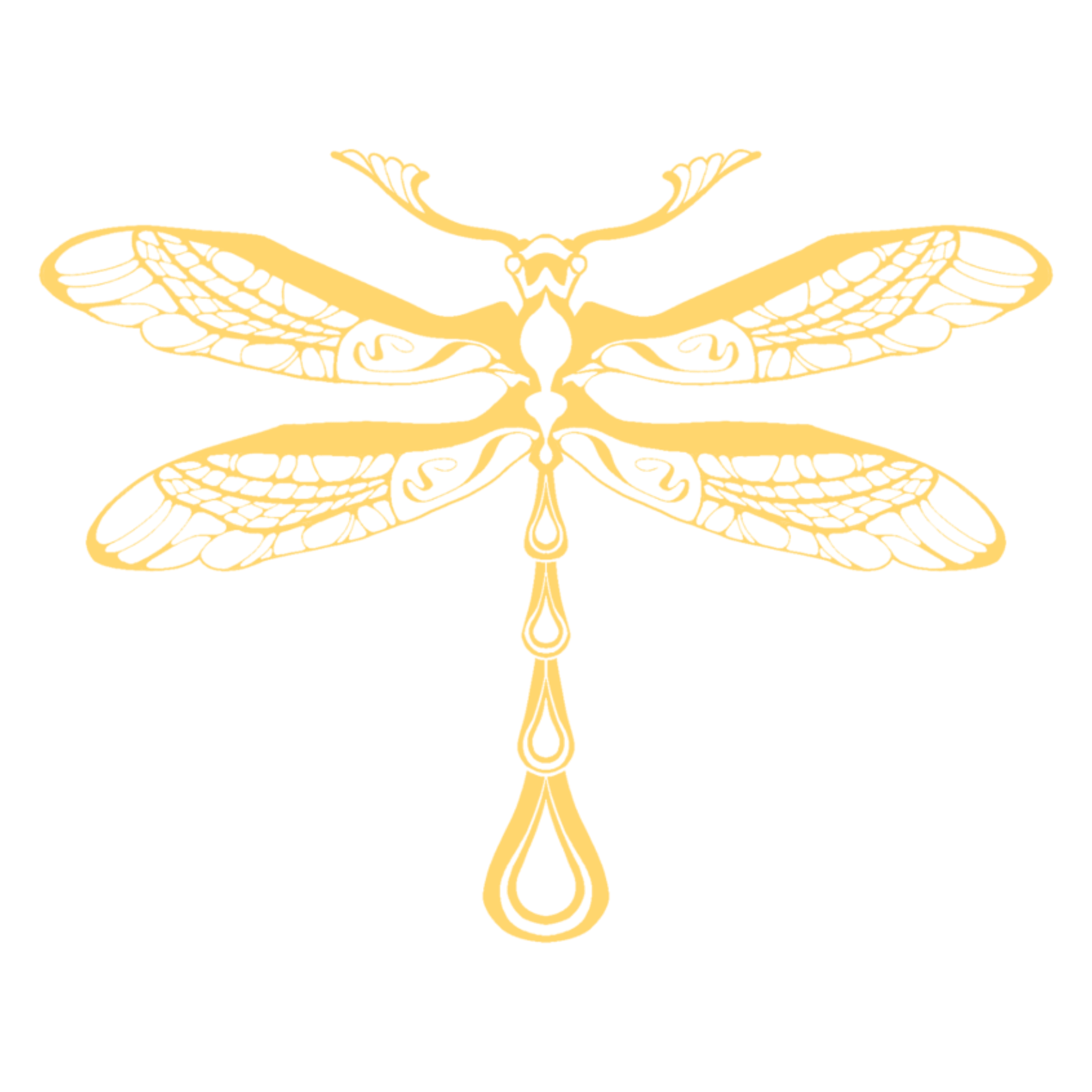
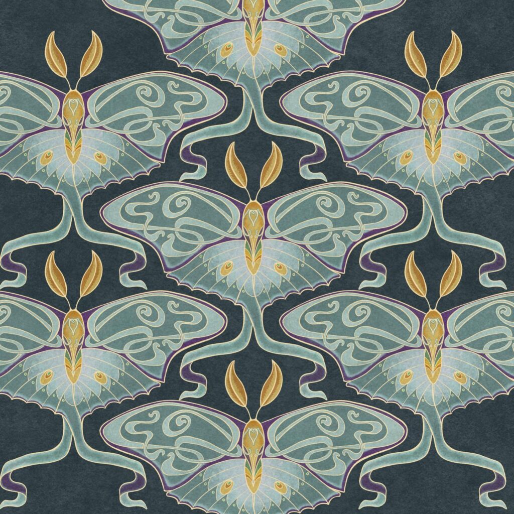
Whiplash Lines
Possibly the most distinctive aspect is the whiplash. Undulating, curving, abstracted lines that both look natural and surreal. These are one of the most challenging things for me to draw and I sometimes do exercises specifically to practice them.
My favorite way to implement them is to replace organic geometry, exaggerate curved lines, and make interesting borders. In Luna Moth I replaced the detail of the upper wings with whiplash lines and gave the lower tendrils a flowing shape to suggest movement.
Asymmetry
Creating balance with asymmetry is a very fun challenge for me. I default to the subject being in the center, but putting it off to one side and filling the space with something else is something I’ve seen in a lot of art from the time period and love to implement.
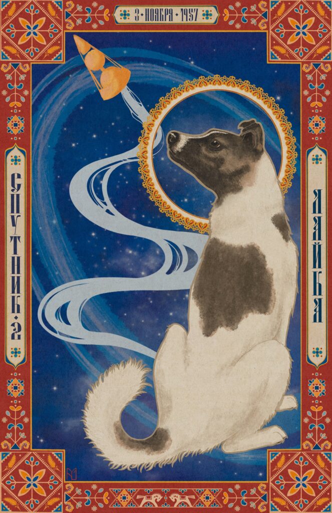
With Laika I balanced her placement on the right side of the canvas with the smoke stream from Sputnik 2 as well as a subdued Saturn-like ring tilting away from her.
The asymmetry doesn’t always have to be filled, but that’s something I’m still practicing.
Historical and Niche Inspirations
The late 1800s saw the beginning of ancient art revivals sparked by the recently rise in archeology. When I make a new piece I always look at the context the story takes place in and incorporate that into my work.
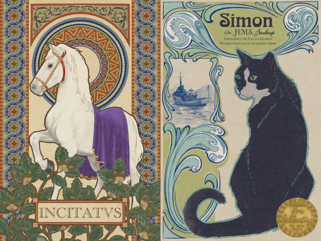
Incitatus (left) was the horse of the Roman emperor Caligula in the first century B.C.E., so I looked to the mosaics of the time to create the majority of the motifs in his design.
Simon (right) was a navy cat aboard the H.M.S. Amethyst during WWII, so I wanted to include some nautical elements. I got a bit more abstract with it, playing into his job as a mouser by taking inspiration from turn of the 19th century luxury cruise liner menus.
Conclusion
These are the main aspects of what I identify with Art Nouveau and how I like to integrate them. Once again, this list is far from exhaustive and is ever evolving. As my style develops what I choose to emphasize changes. I used to heavily rely on the moon behind the subject, but now I’m more flexible in how I incorporate it, sometimes choosing not to entirely. Every artist chooses different elements and inspirations in their art, and I always find it interesting to see inside the creative process and hope to lift the curtain a bit on my own.
What’s you’re favorite part of Art Nouveau? Is it different than anything I mentioned on my list? Leave a comment and let me know!
Leave a Reply